
 In keeping up with my never-ending stream of book cover-related posts, here’s a different one for you. I have certain elements I LOVE about book covers (pretty colors, hearts, watercolor, typography… all of those items can be found here). Not ALL of my favorite book covers have those elements. Lately I’ve found myself more and more drawn to weirder book covers, or more unique ones at least. Here are some book covers that are out of MY normal range of favorites that I’m kind of obsessed with. In fact, there are quite a few books of the opposite design. I’m a fan of the pretty, colorful, upbeat covers with lots of intricacies (or beautiful text). Now, I’m adding a lot more plain, simple, and dark covers to my “cover love” shelf.
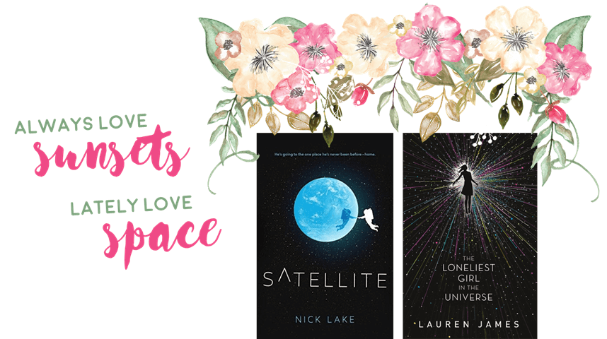
Book cover feature I usually love: sunsets and sunrises
Book cover feature I love lately: dark, outer space elements
I usually love books set on earth (lol) with sunsets or sunrises. It makes for a beautiful, colorful background in the sky. There’s something so jarring about outer space covers; I can never look away from them. These two are really striking for some reason, with the small color elements and black background.
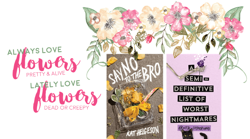
Book cover feature I usually love: pretty and/or watercolor flowers or floral patterns
Book cover feature I love lately: dead and/or creepy flowers
As you can see everywhere on my blog, flowers are my THING. I love watercolor floral designs and pretty, living flowers on book covers. These two covers have very different imagery with flowers. One is a discarded, nearly-dead flower, and the other is a single flower in a skeleton arm. I’d say that’s kinda creepy. But for some reason I just love both of these covers??
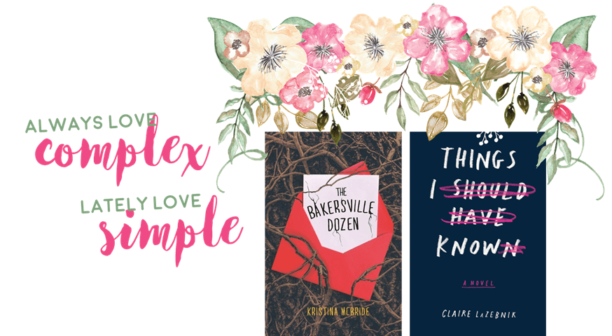
Book cover feature I usually love: complex and intricate typography
Book cover feature I love lately: simple typography
Typography is one of my favorite things. I love brush lettering, calligraphy, and fancy cursive. Any kind of complicated, intricate typography taking over a book cover will make me happy. For some reason, I’ve also been drawn to more simple imagery with basic fonts. These two have very striking but simple fonts, with interesting text effects or backgrounds.
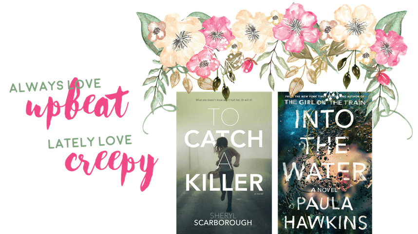
Book cover feature I usually love: upbeat, happy imagery
Book cover feature I love lately: creepy imagery that relates to the story
Judging from what I’ve said in all the paragraphs above, you can tell that I enjoy the bright colors and upbeat imagery that YA contemporary has to offer. Most of the books on that cover-love Goodreads shelf are contemporary books for a reason. However, I’ve noticed a weird attraction to the striking, creepy covers of mysteries and thrillers. They make me want to read the book!
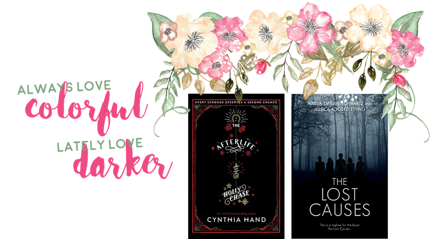
Book cover feature I usually love: lots of pretty colors
Book cover feature I love lately: darker, creepier colors and images
Book covers with watercolor designs and other pretty colors are top of my favorites list, as you know. I can’t explain why these darker covers are interesting me. I know with the first one above, I like the little images and clean design; the text is gorgeous too. Instead of the usual covers with lots of different colors on my shelf, you’ll now see a few more weird and dark covers.

Book cover feature I usually love: bright colors and watercolors
Book cover feature I love lately: muted and plain/pastel colors
And finally, I’m often adding these muted or pastel covered colors to my favorites shelf. These two designs are super pretty and one is very intricate, but they’re out of my norm. The bright pinks and blues and purples are falling away into these more pale (for lack of a better word) covers.

Oh I love this. I don’t really pay attention to covers, but there are some pretty ones here. I love the Into the Water one. That one totally caught my eye. An Unkindness of Magicians looks really awesome too. That white works so well.
Right?! so much detail for such a plain-colored cover!
Love this post!! he Loneliest Girl in the Universe is an awesome cover!! Into the Water is another that is pretty awesome. It is creepy without being too dark.
Right?! I agree!
This is such a cool post! I have definitely found myself gravitating toward covers with more muted colors lately. And I’m always a sucker for pretty typography and flowers (dead or alive, ha)!
Thank you 😀 I love flowers alllll the time too!
I’m curious: have your reading preferences changed as well? I always find I gravitate more towards the covers of the genres I’m currently obsessed with.
But I’m definitely on board with the less is more trend; the ones with just the font especially.
Awesome post idea!
Honestly, not really! haha I just noticed myself putting more weird covers on my “cover love” shelf haha.
Uhm I LOVE your graphics, I think they were the most gorgeous thing about this post! 😉 But I’m also loving the neutral cover of An Unkindness of Magicians, it’s so striking!
Haha thank you <3333
I’m the opposite! Apart from the first two, I cringed at nearly all of these covers. I think I have more of your original tastes in covers, haha. And your graphics are absolutely incredible. This is such a gorgeous post!
lol thanks!
I quite like all of these covers, but I would likely only add two to my cover love shelf – Afterlife and The Bakersville Dozen. I really like them a lot!
I have never really thought about the particulars of what kinds of book covers I love. I just add them to my GR shelf when I want to keep track of them (and even then I don’t really know why! I have never gone to that shelf and looked at the covers, but I still want to take note of them somehow). A LOT of mine are illustrated or have really beautiful fonts because I am a certified font snob, haha.
It’s awesome that you’re open to loving covers that you don’t usually gravitate towards! 😀
Haha I think about covers wayyyy too much, including my favorite aspects! I love fonts too.
I’m really struggling to come up with common themes across the covers I always enjoy. Space is definitely one – I love anything with bright colours against a star-filled backdrop! The font and font placement can make or break a cover for me too – I’m with Chiara, I’m a total font snob.
Based on cover alone, I’m off to check out An Unkindness of Magicians – it’s stunning!