
Lookie here, a new cover-related feature! Who would have thought? When I was going through my ARC shelves on Goodreads, I noticed some similar book covers and thought it would be fun to compare them. For this feature, I’ll be showing two book covers that look super similar, and then comparing the covers to the insides AND how I felt about each book. Which cover wins? Which story wins?

Seven Ways We Lie by Riley Redgate
vs.
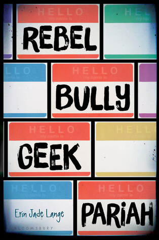
Rebel Bully Geek Pariah by Erin Jade Lange
Cover battle: These are both ARCs I read and received (and were published in) 2016. I remember being more partial to the SEVEN cover just because it was organized nicely and colorful. The plain font for the title wasn’t my favorite though. For REBEL, I liked the font choice and the fact that it was bolder for me. I don’t love that the edges have that weird old-school Instagram filter thing where they’re darker. It’s a toss-up honestly but for some reason I love the starkness and simplicity of SEVEN.
Story battle: Go figure, these were both four star books for me. Of course the toss-up continues. I remember lots of other readers didn’t think the seven POVs in SEVEN were distinct enough, but I didn’t have a problem with them. I thought they were all outlined well because I could tell them apart, but I wasn’t 100% sure which corresponded to each of the deadly sins. REBEL was a book that was completely opposite of what I expected. I was hoping for a contemporary, Breakfast Club-style story. It ended up being a more fast-paced thriller. The ending was insane and the book, overall, was a wild ride. I think from the shock factor alone (and luckily my adjusted expectations after reading Goodreads before starting), REBEL wins here.
Cover winner: Seven Ways We Lie
Story winner: Rebel Bully Geek Pariah
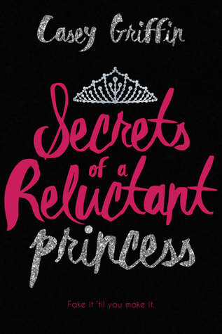
Secrets of a Reluctant Princess by Casey Griffin
vs.
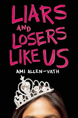
Liars and Losers Like Us by Ami Allen-Vath
Cover battle: These actually came out one year apart and I remember thinking they looked SO similar when the second (SECRETS) was revealed. I’ll be honest – both of these covers caught my eye ASAP because of the colors. Back in my fake pop-punk days of middle school, I was alllll about the pink and black combo. The black cover with the pink text and silver accents = perfection. I usually don’t love people’s faces on covers, so the top-of-the-head thing is better on LIARS. I obviously love the script on SECRETS though. This is a slightly tough one for me because of that reason, but I think LIARS is laid out better and overall more pleasing. I wish the author’s name on SECRETS was underneath and in a different font than the title.
Story battle: Unlike the previous battle of the four star books, this decision is SLIGHTLY more clear. I didn’t love either one of these, to be honest. I gave SECRETS 2.5 stars and LIARS 3 stars. My biggest problem with SECRETS was that it relied on too many tropes and “teen movie from the early 2000s” drama that didn’t feel real in today’s world. The LARPing sideplot was interesting to me though. LIARS was one that gave me pause – I was really conflicted on this rating. I enjoyed the dialogue, for the most part, and the snarkiness between all of the characters (even though the writing itself wasn’t great, and some transitions were awkward). The pacing with prom and everything was odd and the synopsis gave away too much of the latter portion of the book. The ending, however, is what gave this book a better rating – I loved it.

I love this idea! I’m also not a big fan of faces on book covers (I had my fill of that in the 2000s) but I agree that the overall aesthetics are still great. I’m a self-professed cover snob so you are completely speaking my language 🙂 I’m looking forward to seeing more of these, Lauren!
Laura @BlueEyeBooks